Documentation
A visual journey of my portfolio website creation—featuring moodboard, style tiles, sketches, wireframes and the final design
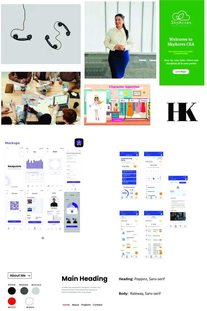
Mood Board
The moodboard captures the overall tone and style of my portfolio website, featuring a monochrome color palette, modern typography, and minimal UI inspiration for a clean and professional design.
Purpose
- To define the visual direction and aesthetic inspiration before starting the design process.
- To ensure consistency in colors, typography, and mood across all pages of the website.
- To communicate the intended look and feel quickly to instructors or future collaborators.
Outcome
- A clear visual guideline that influenced the style tile, wireframes, and final UI design.
- Established a minimal and professional tone for the portfolio website.
- Helped streamline design decisions and maintain a cohesive brand identity.
Rationale & Description
I selected a monochrome palette (black, white, and shades of gray) to maintain a clean and professional look, which aligns with my goal of highlighting my work rather than overwhelming users with colors. Modern sans-serif fonts (Poppins for headings and Raleway for body text) were chosen for readability and a contemporary feel. The minimal UI elements and layout inspiration emphasize simplicity and usability, which are key aspects of good UI/UX design.
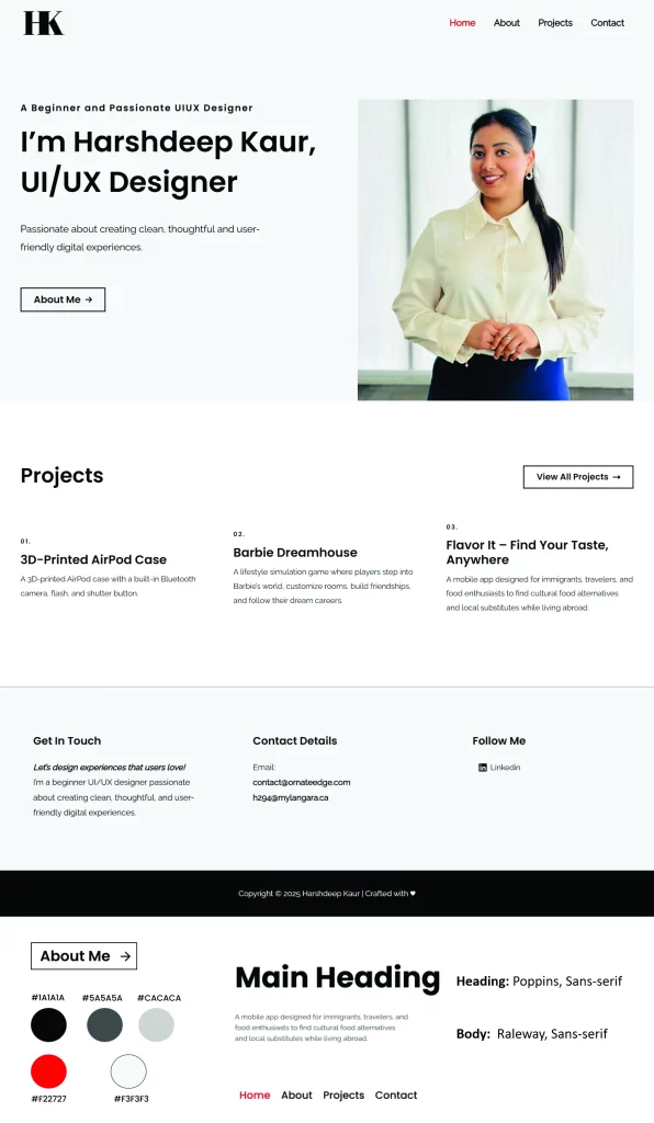
Style Tile
The style tile defines the visual language of the website, including fonts, colors, button styles, and UI elements, ensuring consistency across all pages.
Purpose:
- To establish a consistent visual identity for the portfolio website.
- To guide the design of UI elements, including buttons, headings, and links.
- To translate the moodboard into actionable design choices for development.
Outcome
- A clear reference for colors, fonts, and UI components that maintained consistency across all pages.
- Helped ensure faster and more confident decision-making during the wireframing and high-fidelity design stages.
- Created a foundation for a professional and minimal design style for the website.
Rationale & Description
I chose a monochrome palette (black, white, and gray) with a subtle accent red to ensure visual clarity and highlight call-to-action elements. The heading font Poppins provides a bold, modern presence, while Raleway ensures readability for body text. Rounded black buttons with white text reinforce a clean and minimal UI style. This style tile became the guiding reference for every design element throughout the site.
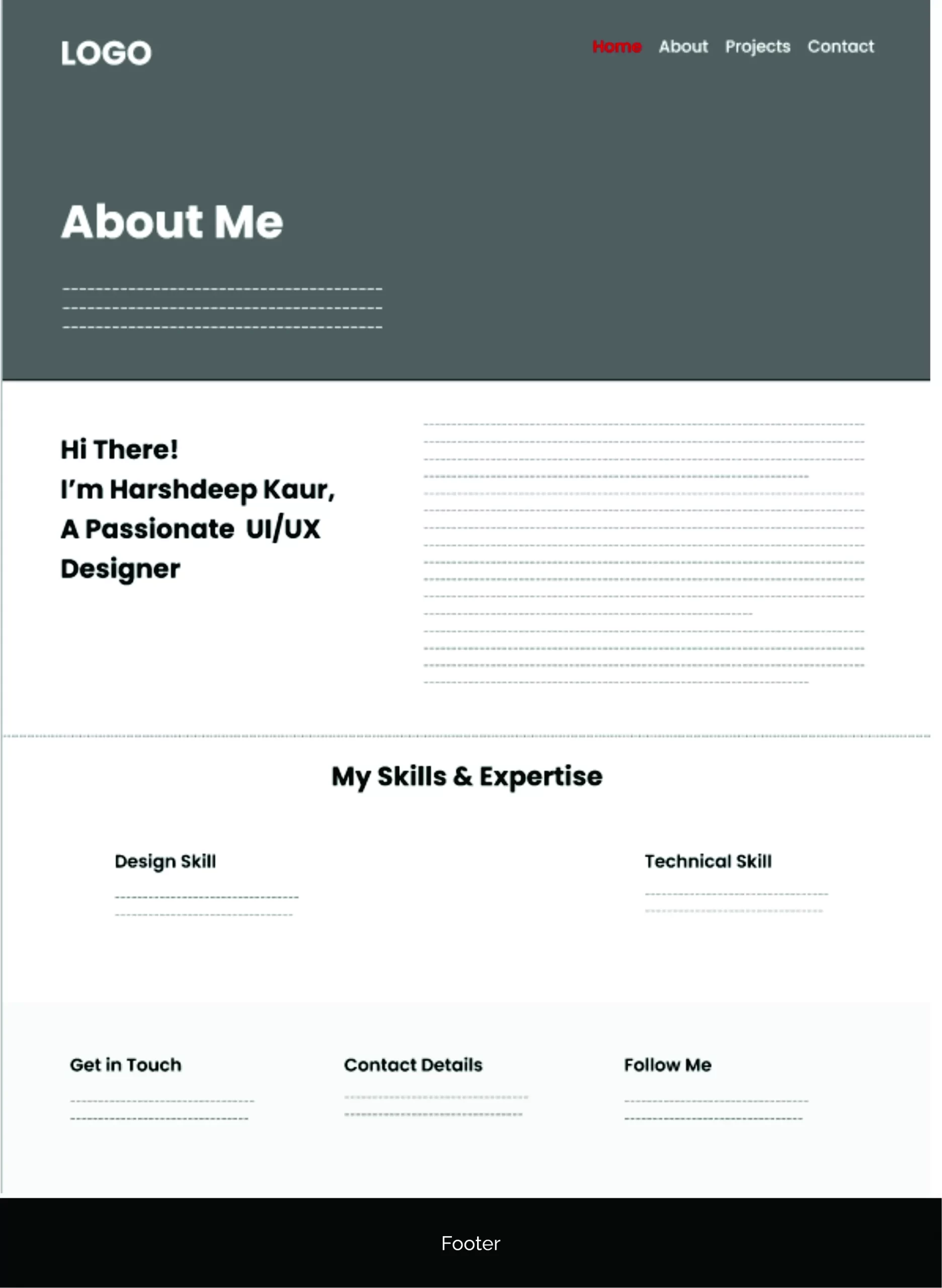
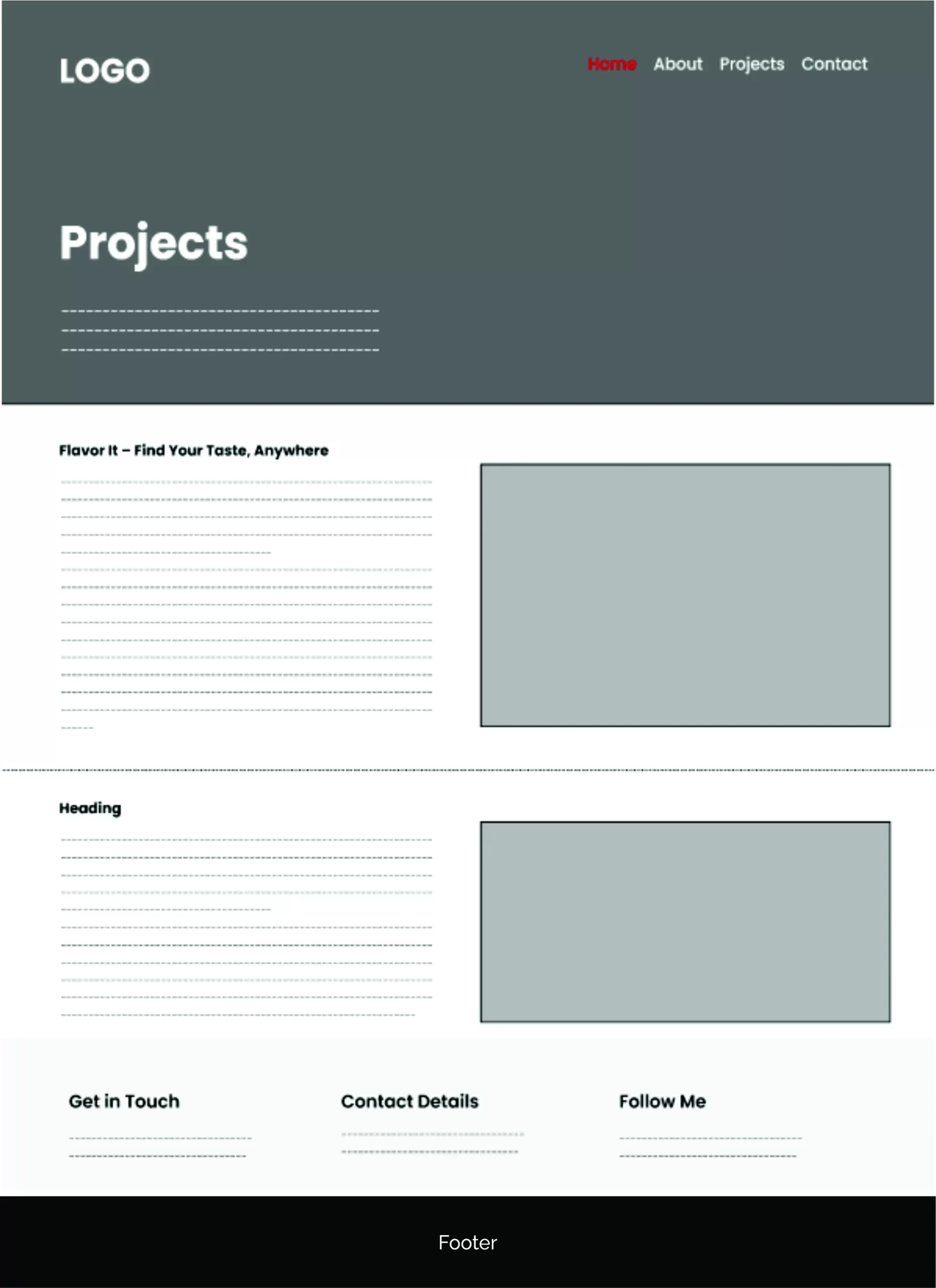
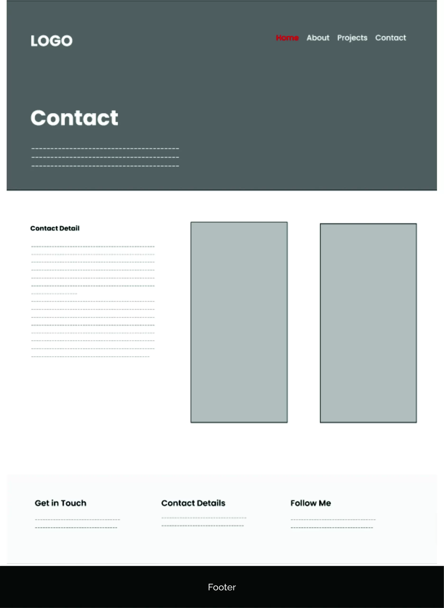
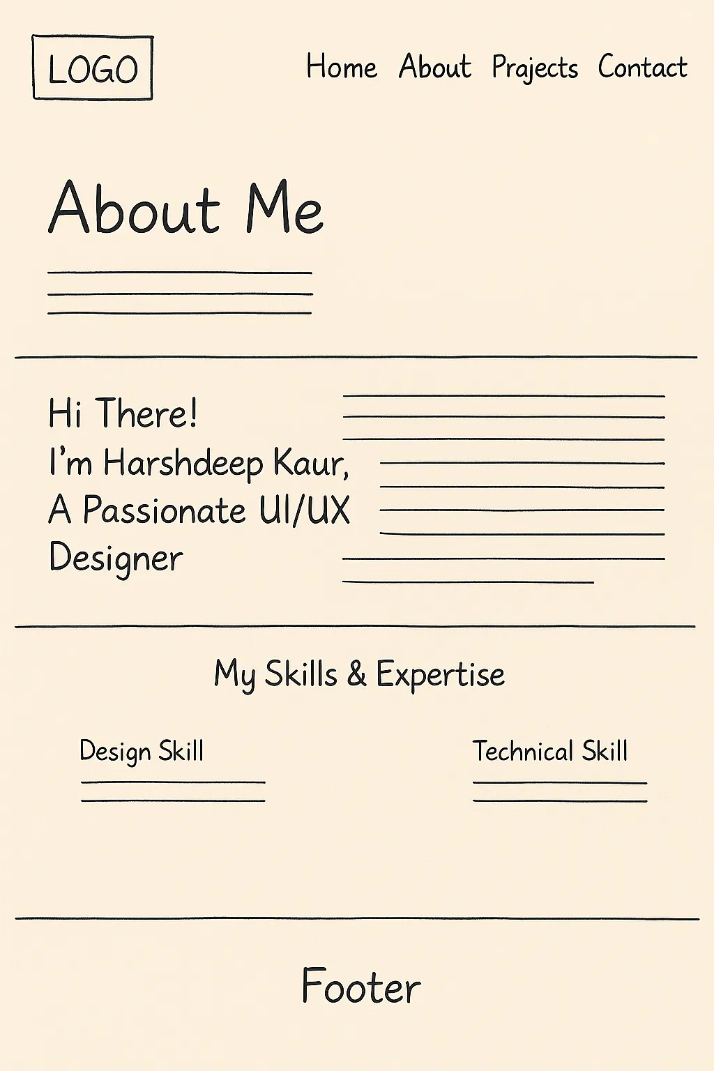
Sketches
Detailed hand-drawn sketches represent refined layouts and give a clear direction for the final wireframes and UI design.
Purpose
The sketches aim to visualize a cohesive, user-friendly portfolio website structure for a UI/UX designer. The intent is to clearly present the designer’s identity, showcase their work, and offer straightforward ways for visitors to connect — all through a consistent visual and navigational framework.
Outcome
- A visually structured layout that’s easy to navigate across devices.
- Logical content grouping to support scannability and fast comprehension.
- Consistent branding and UX language across pages.
- Sketches act as a foundation for hi-fi designs and development.
Rationale
- User-Centered Design: Content is grouped and labeled to match typical user expectations and information-seeking behavior.
- Modular Consistency: Grid-based, repeatable sections (e.g., skills, projects) make the layout flexible and scalable.
- Visual Hierarchy: Key elements like names, headings, and project titles are prominent to draw attention.
- Accessibility-Ready: Structured layouts accommodate screen readers and responsive behaviors for all device types.
- Low-Fidelity Clarity: The hand-drawn sketch format (as referenced in the Contact Page sketch) keeps the focus on structure and function, free from distractions of color, font, or interactivity.
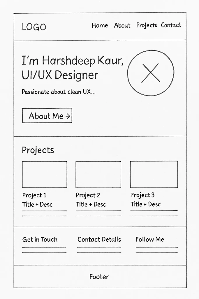
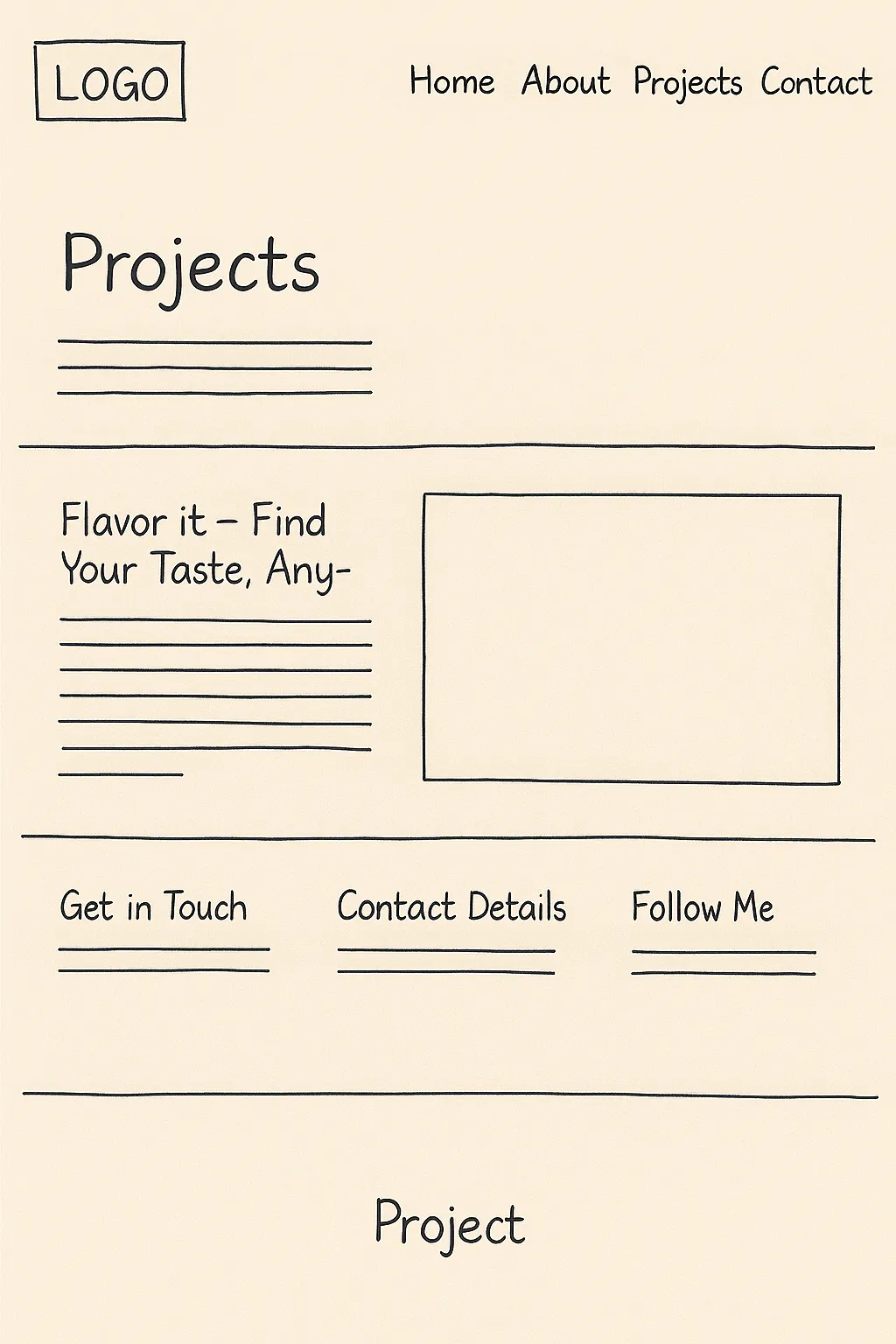
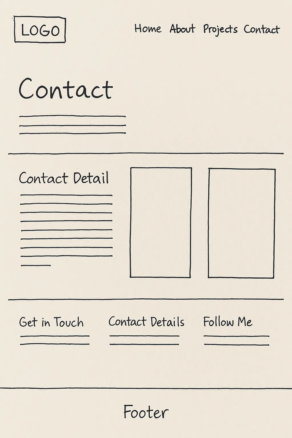
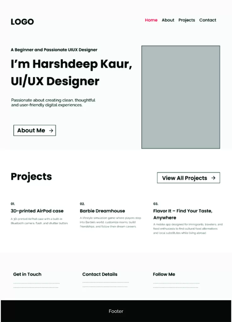
Wireframes
Low-fidelity wireframes define the website’s layout, spacing, and content structure before adding colors and interactive elements.
Purpose:
To effectively showcase the designer’s portfolio projects in a clean, organized, and easily scannable layout that highlights project titles, descriptions, and visuals. This helps users quickly grasp the designer’s capabilities, thought process, and outcomes of past work.
Outcome:
- Visually Balanced Layout: Project text (title and description) is paired with corresponding images to tell a complete story.
- Scalable Design: Repeated blocks allow for adding more projects without disrupting the layout or hierarchy.
- High Engagement Potential: Visitors can easily read through and connect with each project’s value.
Rationale:
- Two-Column Layout: Follows a proven pattern of reading left (text) to right (visual), improving comprehension and flow.
- Information Hierarchy: Bold project titles and structured description areas help users quickly skim or dive deeper.
- Whitespace Use: Separation between sections prevents content fatigue and supports mobile responsiveness.
- Consistent Branding: Header, footer, and section styling match the rest of the site for a seamless user experience.
- Call-to-Action Ready: Contact section at the bottom ensures users are prompted to engage without hunting for links.